
Update 2024: I've published a small playground that allows you to easily see how different browsers render your sizes and srcset combination -> playground.
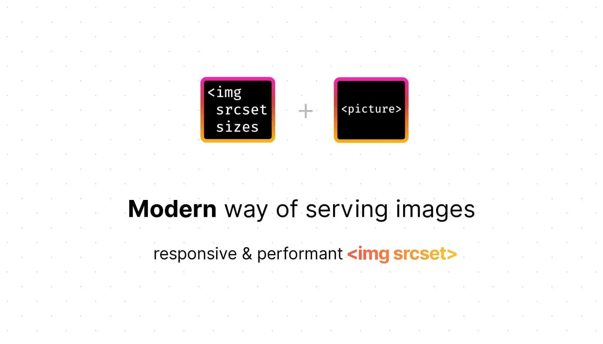
The HTTPArchive found at least 70% of all websites have an image as the most prominent element, yet only 34% of the web uses <img srcset> to create responsive & performant images (and even fewer use <picture>). To change this, the following article will guide you through responsive image techniques, and introduce a novel technique that aims to make <img> tags work (almost) like <picture> tags, making migration in existing codebases easier. With the reduced engineering effort, this hopefully helps you improve the images on your website in 2023.
Table of contents
Open Table of contents
Why we need responsive images
In general, high-quality images lead to a better user experience. There are countless articles on this topic on the web, and studies on human perception of images and their image quality are almost endless.
(...) high-quality and professionally shot pictures consistently lead to higher engagement (...)
So let’s take a step back. What checkboxes do responsive images need to tick other than high quality?
Huge screens and small screens, such as desktop vs. mobile, should be able to display different dimensions. Phones have less screen space, so we need to be more careful about what is visible ‒ especially important when working with marketing teams who typically provide different images for different devices.
We should also always consider the current zoom level, as zooming is more common than you might think (e.g. for accessibility reasons). When users zoom in, the DPR changes, so it makes sense to show a higher resolution image.
Not to neglect performance, lower image quality results in smaller file sizes (file formats also affect this), which is important for page load speed and Web Vitals. By loading less, we also waste less mobile data and make sure to create a good experience for countries where people have slow internet, old devices and have to pay per megabyte downloaded. More on file formats & quality later.
This brings us to the following checklist:
☑️️ Serve different dimensions based on the viewport size (e.g. different images for desktop and mobile)
☑️️ Serve different qualities based on the viewport size
☑️️ Serve different qualities based on Device-Pixel-Ratio (DPR) / zoom level
☑️️ Optional: Deliver different file formats (WebP, AVIF, …)
Let’s dive right in how to meet those requirements.
One fits all: The <picture> tag
Jake Archibald’s article Serving Images For High-Density Displays suggested an approach in 2021. He uses the <picture> tag to check all the requirements (including optional), which I’ll explain in the following:
<picture>
  <source
    // `media` contains a CSS media query (MQ) that is used to control which
    // specific source to render (first true `<source>` wins)
    media="(-webkit-min-device-pixel-ratio: 1.5)"

    // `srcset` contains the path to an image and an 'intrinsic width descriptor',
    // corresponding to the original image width on your device
    srcset="2x-800.jpg 800w, 2x-1200.jpg 1200w, 2x-1598.jpg 1598w"

    // `sizes` consists of a CSS MQ condition and the width of the slot
    // You can also use a viewport width (`vw`)
    sizes="
      (min-width: 1066px) 743px,
      (min-width: 800px) calc(75vw-57px),
      100vw">
  <img src="1x.jpg" alt="">
</picture><picture>
<source
// `media` contains a CSS media query (MQ) that is used to control which
// specific source to render (first true `<source>` wins)
media="(-webkit-min-device-pixel-ratio: 1.5)"
// `srcset` contains the path to an image and an 'intrinsic width descriptor',
// corresponding to the original image width on your device
srcset="2x-800.jpg 800w, 2x-1200.jpg 1200w, 2x-1598.jpg 1598w"
// `sizes` consists of a CSS MQ condition and the width of the slot
// You can also use a viewport width (`vw`)
sizes="(min-width: 1066px) 743px,
(min-width: 800px) calc(75vw-57px),
100vw">
<img src="1x.jpg" alt="">
</picture>In this example, for old browsers and below 1.5x DPR screens, the 1x.jpg image is loaded. For other screens, browsers differentiate based on the viewport width, so modern phones load 2x-800.jpg, desktops 2x-1598.jpg.
The <picture> tag consists of any number of <source> tags and one <img> tag. The latter works like the standalone <img> tag, you can add an alt attribute, loading="lazy" and so on.
To determine which image is rendered, <picture> tells the browser to load explicitly what you want the browser to load (= what is defined by <source>), sort of saying “I’m in charge of figuring out when you should load which image, follow my instructions”.
We now can…
☑️️ Serve different dimensions based on viewport
☑️️ Serve different qualities based on viewport
☑️️ Serve different qualities based on DPR / zoom level
☑️️ Optional: Deliver different file formats
As we can see, the <picture> tag is the perfect way to explicitly tell the browser what to do in which scenario. If you start out fresh, you are likely better off using a <picture> tag for responsive, high-performance, sharp images.
However, thinking further: There is a downside of switching to <picture> – moving away from plain <img> tags comes with considerable refactoring, engineering time and effort in existing codebases. In the following chapters, I’ll present you the options we have if we want to keep using the good ol’ <img> tag to avoid the mentioned downsides.
Comes with surprises: <img srcset>
The other alternative to the <picture> element is to use <img srcset>. For both elements you give the browser images plus information about them. However, the subtle difference between those two tags is: With <img>, you give control to the browser ‒ essentially telling the browser “you’re in charge of figuring out which image is best to load”. Because <img> is much more commonly used than <picture>, most sites tend to use one of the following approaches to displaying responsive images.
Pixel Density Descriptors
First, let’s have a look at ‘pixel density descriptors’, where the unit is ‘x’, short for dots-per-px (dppx), which reflects the DPR.
<img srcset="medium.jpg, large.jpg 2x, ultra.jpg 3x" ... />In this case, browsers on standard monitors load ‘medium.jpg’, on higher resolution displays (e.g. retina displays, iPhones, any modern Android, 4k monitors, …) we get ‘large.jpg’, or ‘ultra.jpg’.
Density descriptors allow us to use a trick that has been around since 10 years (2012). The Filament Group published an article that introduces you to the idea of halving the image quality for high DPR screens. You keep images twice as big as their rendered size (e.g. intrinsic size 400x400 -> rendered 200x200) while reducing the qulity to 50%. Because of the image downscaling that browsers do to display the images, they will look sharp while having a much smaller file size.
What does this approach tick?
❌ Serve different dimensions based on viewport
❌ Serve different qualities based on viewport
☑️️ Serve different qualities based on DPR / zoom level
❌ Optional: Deliver different file formats
Even if you reduce the quality to 50%, this approach means your phone will load a larger image than necessary, as you have no control over the dimensions and therefore cannot serve different images to different viewport widths. 🫥
On mobile, we degrade website performance through long download times, waste user data volume and tax the CPU by decoding+rendering larger images (which also increases battery usage).
Can we do better? Yes.
You can also use density descriptors in background images using CSS image-set, but they have their own performance drawbacks, as explained by Harry Roberts. Thus, I would not recommend using them.
Width descriptors
Next up is the most popular way to use responsive <img>s these days. This is best explained as follows:
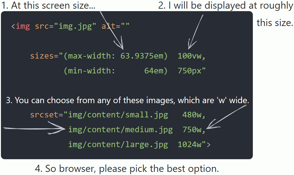
The srcset and sizes attributes work in exactly the same way as they do for the <source> tag, except that we don’t have the media attribute available. In the code snippet above, to figure out what image to render, browsers use the first sizes media query which evaluates to true. Let’s assume it’s (min-width: 64em) 750px – the 750px tell the browser ‘please render the width descriptor of (minimum) 750w’, so browsers load medium.jpg. Older browsers fallback to src.
Width descriptors also adapt to the device’s DPR, which Chris Coyier from CSS-Tricks blogged about way back in 2014. Browsers may have changed a bit since then, so let’s take a look at what different browsers do today:
<img src="small.jpg" srcset="medium.jpg 1000w, large.jpg 2000w" ... />
Per spec, browsers will divide the width descriptor by the ‘source size’ of the <img> element to determine the density of each image, and then compare it to the device’s DPR (includes the current zoom level). The ‘source size’ is defined by the sizes attribute and, if omitted, defaults to 100vw (the current screen width).
Firefox & Safari choose the density greater than the current DPR (if not possible, the highest) to determine the output image. Chromium does the same for DPRs <= 1x, but for DPRs > 1x, Chromium based browsers check the geometric mean between the values to determine the image to display1:
// imagine this to be a very simplified loop
if (next_density < DPR) { continue; /* skip to next srcset entry */ }
if ((DPR <= 1 && DPR > current_density)
  || DPR >= geometric_mean(current_density, next_density))
  return next;
return current;
As a rule of thumb, Chromium browsers pick the image that comes closest (in srcset described width) to the viewport width for DPRs > 1x.
Let’s take a look at an example. For a viewport width of , browsers do the following calculations to get the density:
With a DPR of :
- Firefox & Safari select the density from slot
- Chrome:
- calculates geometric mean: √ = x
- is , so is selected
, or
Update 2024: Confused by all of this? I've published a small playground that allows you to easily see how different browsers render your sizes and srcset combination -> playground.
To summarize, since width descriptors are implicitly also pixel density descriptors, we can see why width descriptors are the more popular way to use srcset. However, this behaviour comes with some frightening surprises:
First of all, the difference in browser implementation. The spec leaves it up to the user agent to determine the best image. Use the playground to check different DPR & viewport widths, or open this post on another device/browser and look at the top left corner of the image. You’ll notice, some load the same image, even if it’s displayed much smaller on your phone. So using the implicit mechanism removes the ability to explicitly target viewport sizes. Second, the approach leads to performance issues (which the WhatWG has also acknowledged2):
We estimate that 33% of desktop pages are loading more than 83 KB of extra image data, based purely on bad sizes attributes. That is to say: A better, smaller resource is there for the picking in the srcset, but because the sizes attribute is so erroneous, the browser doesn’t pick it. Additionally, 10% of desktop pages that use sizes load more than 0.5 MB of excess image data because of bad sizes attributes!
The HTTPArchive also mentions that 10% of the sites waste 283 KB on mobile. 83 KB is the equivalent of loading the full React library twice on the same page. I don’t know anyone who thinks this is a good idea, and the stats don’t even include the missed savings from not optimising for file size.
In total, what does this approach tick?
☑️️ Serve different dimensions based on viewport
☑️️ Serve different qualities based on viewport
☑️️ Serve different qualities based on DPR / zoom level – implicitly
❌ Optional: Deliver different file formats
Can we do better? Yes.
We’re aiming for an approach where we can serve different dimensions and qualities based on viewport size and DPR / zoom level to have a solution that is also great for performance.
Best of both worlds: The ‘boolean’ <img> tag
Without further ado, let me introduce a hybrid-<img>-tag, which combines learnings from the previous chapters. Here we have an <img> tag that combines sizes & srcset’s width desciptors and the implicit density calculation to act like a <picture> element:
<img src="1x.jpg"
   sizes="
    (max-width: 480px) and (-webkit-device-pixel-ratio: 1)       1px,
    (min-width: 481px) and (-webkit-device-pixel-ratio: 1)       2px,
    (max-width: 480px) and (-webkit-min-device-pixel-ratio: 2)   3px,
    (min-width: 481px) and (-webkit-min-device-pixel-ratio: 2)  16px"
  srcset="
    medium-1x-q75.jpg   1w,
    large-1x-q75.jpg    2w,
    medium-2x-q35.jpg  15w,
    large-2x-q50.jpg   16w"
/><img
sizes="
(max-width: 480px) and
(-webkit-device-pixel-ratio: 1) 1px,
(min-width: 481px) and
(-webkit-device-pixel-ratio: 1) 2px,
(max-width: 480px) and
(-webkit-min-device-pixel-ratio: 2) 3px,
(min-width: 481px) and
(-webkit-min-device-pixel-ratio: 2) 16px"
srcset="
medium-1x-q75.jpg 1w,
large-1x-q75.jpg 2w,
medium-2x-q35.jpg 15w,
large-2x-q50.jpg 16w"
src="1x.jpg">Don’t let the cute Pandas distract you from the hybrid-picture-<img>-tag. I’ll explain the numbers in a minute, and why the third sizes entry does not match the third srcset entry.
Explainer
By combining sizes and srcset (width descriptors), we get back the control of what browsers do. As mentioned earlier, the width descriptors work implicitly, so we introduce a specially crafted sizes attribute that targets individual DPRs to help us make it explicit again. Our crafted <img> tag now behaves like a <picture> tag, with no additional tags required. We can conditionally load high quality images in different dimensions and different qualities.
Not changing the DOM structure significantly reduces the amount of development time required, as we spend less time rewriting or reordering. This is huge when ‘hot fixing’ blurry images in a large codebase.
sizes attribute
As explained earlier, sizes allows us to use CSS media queries, which means we are not limited to min- & max-width. Also, articles like Andrea Verlicchi’s “Cap Image Fidelity to 2x” and a study on visual acuity by Cloudinary provide great insight into why we don’t need to differentiate between 2.5x, 3x, or even higher resolutions.
For the conditions in the attribute, we use
480pxas the breakpoint to differentiate between the categories ‘phones’ and ‘other devices’(-webkit-device-pixel-ratio)&(-webkit-min-device-pixel-ratio)to differentiate between 1x DPR and >= 2x DPR screens
The conditional -webkit-(min)-device-pixel-ratio is well supported, even in non-WebKit browsers. If you only support Safari 16 and higher, you could replace the prefixed condition with (resolution: 1dppx) and (min-resolution: 2dppx) (caniuse).
Now we get to the trick, if we keep in mind that browsers pick the first truthy condition, we can craft statements that work almost like if-else:
If screenwidth <= 480px && DPR == 1: Load slot ‘1’
Else-If screenwidth >= 481px && DPR == 1: Load slot ‘2’
Else-if screenwidth <= 480px && DPR >= 2: Load slot ‘3’
Else-if screenwidth >= 481px && DPR >= 2: Load slot ‘16’
The value per query is no longer the image width we’re trying to display, but rather it is now the srcset slot we’re targeting. In other words, we remove the (approximate) correlation between ‘image width’ and ‘width descriptor’, and instead we use the number to target specific slots of srcset. Using the technical terms of the spec, we set the ‘source size’ of the <img> tag to the selected slot.
Voilà, we now have ‘boolean’s to differentiate when to load what image!
srcset attribute
As mentioned, we’re now using the ‘px’ from sizes to set the ‘source size’ in order to target a specific slot of srcset. Combined with knowledge about implicit density calculation mentioned in the ‘Width descriptors’ chapter, we create an srcset map that tricks the browser into downloading the image from our true sizes condition, which is the next largest slot (or the lowest geometric mean1).
As this is a bit harder to grasp, let’s take a look at an example with a DPR of and a screenwidth of :
- For the
sizesattribute, is the first MQ to evaluate totrue, telling the browser to set the ‘source size’ to - Next, browsers determine the correct
srcsetslot:
- Density:
- ,
- ,
- Slot picked in all browsers is , because:
- Next largest density (Firefox, Safari): from slot
- Chromium:
- calculates geometric mean: √ =
- is , so slot is selected
- Density:
, or
In the future, there might be devices with 5x DPR, so to prevent blurry images from reappearing in 2030 (wild guess), we need to make sure that both 2x DPR size values are multiplied by 5 so that Safari & Firefox pick the correct srcset value (3*5 => the next largest is 15w). This will only work until screens larger than 5x come along, but since we’re already reaching the limits of human perception, I think the ever-increasing DPR support of the last few years is likely to be capped2, and even 5x is just a precaution.
The last slot in sizes and srcset is basically the else in our if-else chain, which means we can simply add +1 to create the last slot to be used by 'other devices' && DPR >= 2 category.
Last but not least, we set a default by using the src attribute for browsers that do not recognize anything we do. If no MQ matches, the default is 100vw.
Conclusion for ‘boolean’ <img> tags
By using this approach, we can safely tell what browser or device renders what image. No more surprises. While <picture> is more explicit than this approach, using the ‘boolean’ <img> tag is less of an engineering effort than refactoring by introducing additional HTML tags and all that goes with it, such as updating dependencies regarding JavaScript events and CSS. In contrast, adding or updating the two attributes srcset and sizes is easy.
We now can…
☑️️ Serve different dimensions based on viewport
☑️️ Serve different qualities based on viewport
☑️️ Serve different qualities based on DPR / zoom level – explicitly
If you automate it (e.g. use a component/lib that automates creating this), you will no longer have to craft this on your own. The following mathematical formula can be implemented anywhere, with N, M being the image width per category and A the breakpoint number:
<img
  sizes="
    (max-width: Apx) and (resolution: 1dppx) Npx,
    (min-width: (A+1)px) and (resolution: 1dppx) Mpx,
    (max-width: Apx) and (min-resolution: 2dppx) (M+1)px,
    (min-width: (A+1)px) and (min-resolution: 2dppx) (((M+1)*5)+1)px"
  srcset="
    low-dpr-xs.jpg Nw,
    low-dpr-xl.jpg Mw,
    high-dpr-xs.jpg ((M+1)*5)w,
    high-dpr-xl.jpg (((M+1)*5)+1)w"
  src="fallback.jpg"
  alt="don't forget the alt attribute"
/>
Appendix: File Formats & Quality
Now that we have ticked every mandatory checkbox, there is one thing left: The optional checkbox and getting around <source> tags that differentiate between e.g. PNG and WebP file formats. The web.dev article lists all options here.
TL;DR: Image optimization proxies automatically deliver different file formats on the same URL by checking request HTTP headers. This means we do not need to do it in the HTML.
Image proxies give us an additional advantage: such proxies also allow us to define the quality and DPR of the image.
At my current employer, Jochen Schweizer mydays Group, we’ve tested how different JPEG image qualities are perceived and found no perceiptable difference betweeen 50% and 35% quality for smartphones with 2x DPR screens. Same for 1x screens in general, where 75% works fine for us. YMMV, so you should A/B test for your website3.
Now we can kind of:
☑️️ Deliver different file formats
For those who want to try at home™ ‒ for Apache web servers, you can easily do so by rewriting the request:
.htaccess file content
<IfModule mod_rewrite.c>
  # if jpeg/png image...
  SetEnvIf Request_URI "\.(jpe?g|png)$" REQUEST_image
  # ...tell CDNs the request varies per `Accept` header
  Header append Vary Accept env=REQUEST_image

  RewriteEngine On
  # Check if browser supports WebP images in `Accept` header
  RewriteCond %{HTTP_ACCEPT} image/webp
  # Check if WebP replacement image exists on server
  RewriteCond %{DOCUMENT_ROOT}/$1.webp -f
  # Serve WebP image instead
  RewriteRule ^(.+)\.(jpe?g|png)$ $1.webp [T=image/webp]
</IfModule>
Code similar to HTML5boilerplate’s config.
Appendix: Cache & Debugging
While the math in this post is updated when you zoom, Chromium-based browsers are optimised for less network usage because img tags will not load lower resolution images if there are higher resolution images in the cache, even if you turn off caching in DevTools. This means that if you rotate your phone to landscape, the higher resolution image will remain. So be sure to refresh the page when testing this article with cache disabled.
Last but not least, a quick note on debugging the DPR – your friend and helper DevTools makes your life easier than working with different devices to debug. Here’s how to toggle the DPR:


Footnotes & Comments
Thank you Andrea Verlicchi, Barry Pollard and Ivan Akulov for the invaluable feedback for this post.
Footnotes
-
See this Twitter thread and the Blink code. ↩ ↩2
-
The WhatWG issue is open since 2019 and Chromium also has an open issue that you can star, which proposes to cap the DPR used to calculate at 2.2x. ↩ ↩2
-
There is also a codec comparison from the WebP team, where you can compare WebP2 vs. JPEG XL and so on for yourself. ↩